
Contents (4)

·
⚡ Pickful is faster, smoother and more consistent | 11.6
Pages open faster, a failed post no longer wipes your text, and error pages, dark mode and layout got a full tidy-up.
Hey Pickful community,
Over the past few days we went through the whole site, page by page, and wrote down everything that was slow, easy to trip over, or just looked off. Then we fixed it, one item at a time. This post covers the part you’ll notice every day.
⚡ Faster
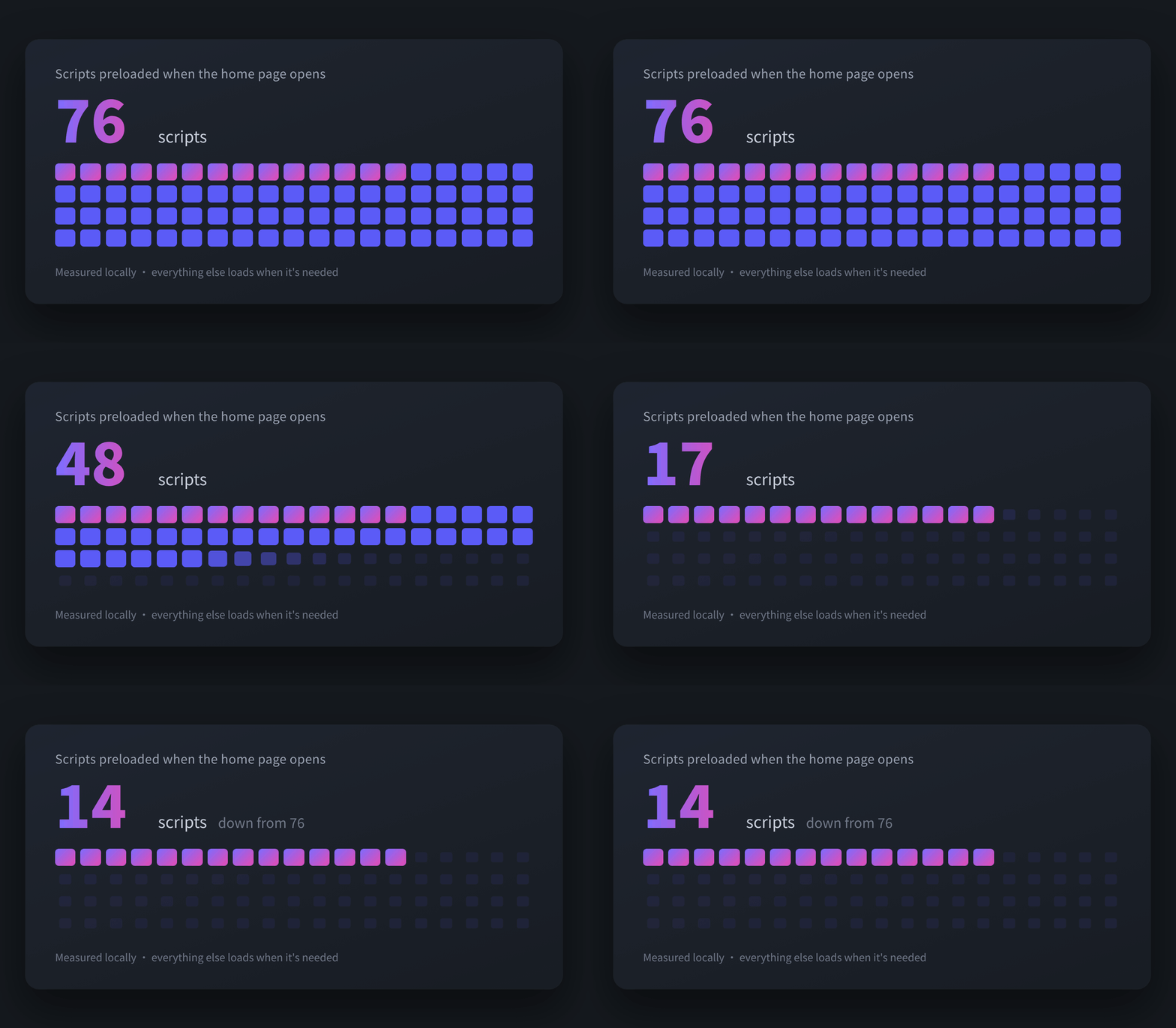
- The home page loads far less up front: the scripts it preloads went from 76 to 14 (measured locally). Everything else loads when you actually use it; charts, for example, only load on pages that have charts
- Feeds scroll faster: on the home, topic and profile pages, each screen of posts now fetches everything it needs in one go instead of one post at a time. Topic and profile pages never had this before, so that’s where you’ll feel it most
- Images load when needed: book and topic covers are sized to how they’re shown, and only start loading as you scroll near them
Two caching bugs are fixed along the way:
- After switching language, some parts of a page stayed in the old one: each language now has its own copy, so a switch is a clean switch
- An article you read while signed out could keep showing the signed-out version after you signed in: article pages now check for the latest version every time
✍️ Smoother to write
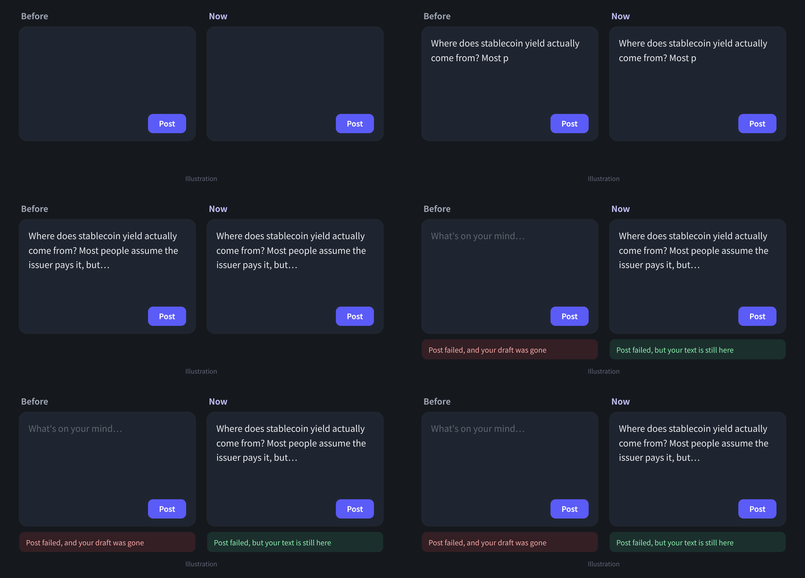
- A failed post keeps your text: before, if a post was blocked (for example, not enough points yet), the box was cleared and everything you’d written was gone. Now the message still shows, and your text stays right where it was
- Not enough points? You’ll know first: posting needs more than 2 points. If you’re short, you’ll see a note before you start typing and the post button is greyed out, so you don’t find out only after writing
- Easier to tap on phones: the buttons on the post toolbar have bigger tap areas, and the links in the top bar no longer wrap onto two lines
- Times and theme names follow your language: things like “3 minutes ago” and theme names now show in the language you picked
🎨 More consistent
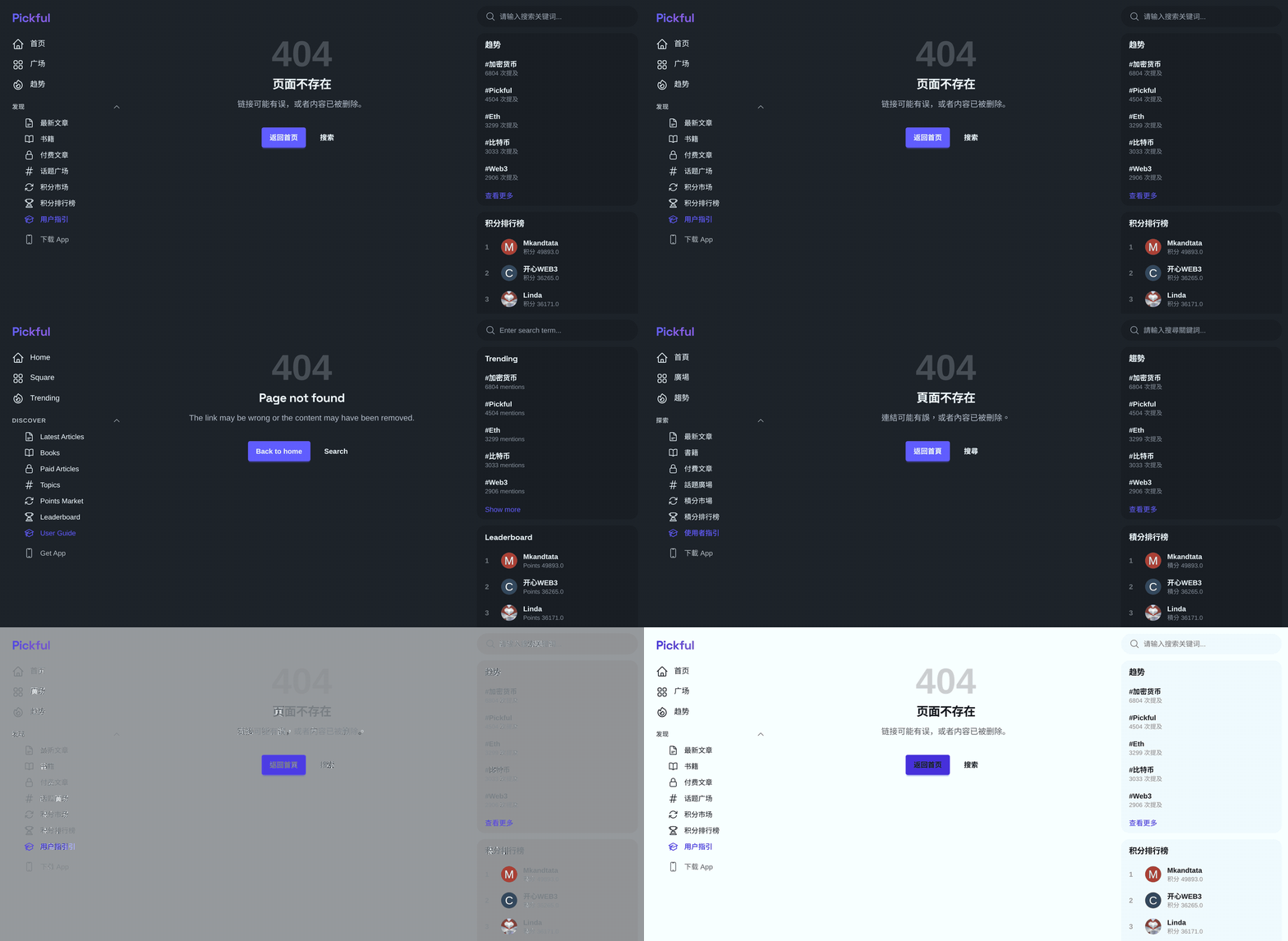
- Error pages look like Pickful: a broken link or an error no longer lands you on a bare white page. You get a normal page with the navigation, plus “Back to home” and “Search”, in all three languages
- Heading sizes line up: 33 section headings had no size of their own, so a card heading could end up bigger than the page title. The hierarchy is clear now
- Grey text comes in three set shades: secondary text is easier to read in both light and dark mode
- Usernames show exactly as you wrote them: the first letter used to be capitalised automatically. Not any more
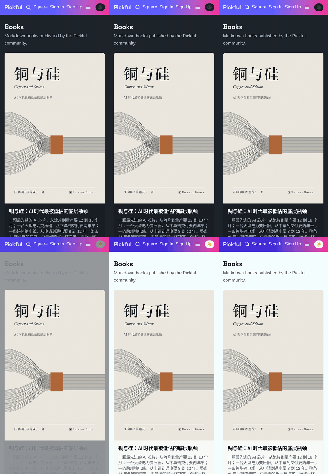
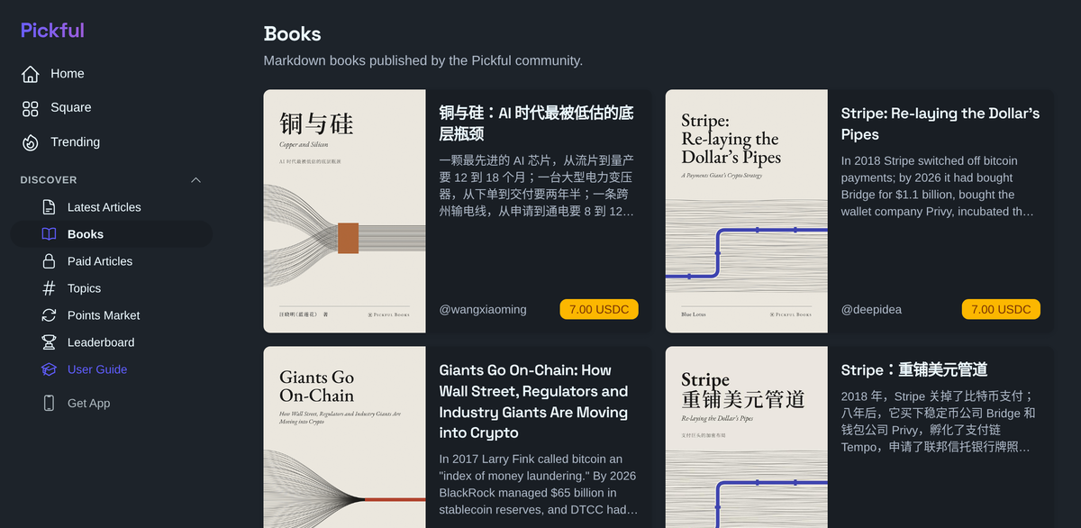
- Book cards show at most four lines of summary, so the list stays tidy
- One colour for main buttons: the gradient is kept for the most important entry points in the sidebar and top bar; every other button uses the same colour
- “Nothing here yet” messages share one style, and two lines that were only in English now have Chinese and Traditional Chinese too
- Finished bounty pools on a topic page fold into one line instead of taking up a big block
💬 To the community
None of these changes is big on its own, but you run into them every day. If something still feels slow or awkward, tell us and we’ll keep going.
This update is live on Web, iOS and Android. No app update needed.
Pickful Team
11.6
Repost this post?
Share with your followers.
Reply